


UX/UI - Product Design - Graphic Design
DesignLab
March 2022
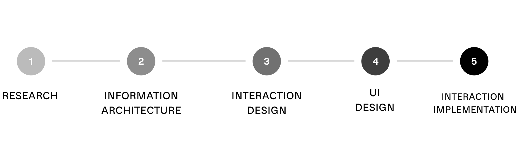
Scope and Focus
For this project, I was tasked to create Mirror's visual branding and design the company's responsive website due to high customer demand. Before contacting me, the clothing brand was not in the e-commerce space and was eager to make the digital transformation with an updated visual identity/responsive website.
High-Level Design Goals and Objectives
Understand what attracts customers to purchase clothes from certain online websites.
Develop a responsive website that caters to Mirror’s online demographic.
Determine desirable features through UX research for online shoppers.
Design a unique/neutral online shopping experience.
Defined Deliverables
Logo Design
Brand Identity
Responsive Website (Desktop, Tablet, Mobile)
UX Research Methods
Comparative and Competitive research to observe how competitors offer e-commerce.
Customer Surveys to understand what customers want from the e-commerce shopping experience.
Customer Interviews to learn the various ways users interact with their preferred online shopping websites.

Initial Research
To intuitively understand users' eCommerce desires, I began my research with a direct/indirect competitive analysis. First, I interviewed four people who fit the preferred user categories of shoppers. After recruiting the interview participants, I developed an interview/usability test to understand the specific motivations & frustrations of a user.
Competitive Analysis: Direct competitors analyzed for strengths and weaknesses.
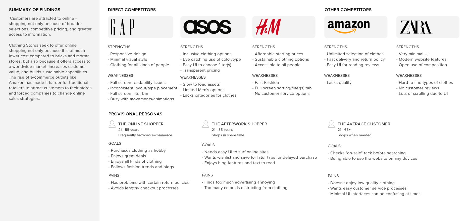
Preferred Online Website Users to Interview:
Users that surf/browse/purchase from online stores on a weekly/bi-weekly basis.
Users that shop for clothes using websites or apps.
User Interview Conclusions: Documented Findings
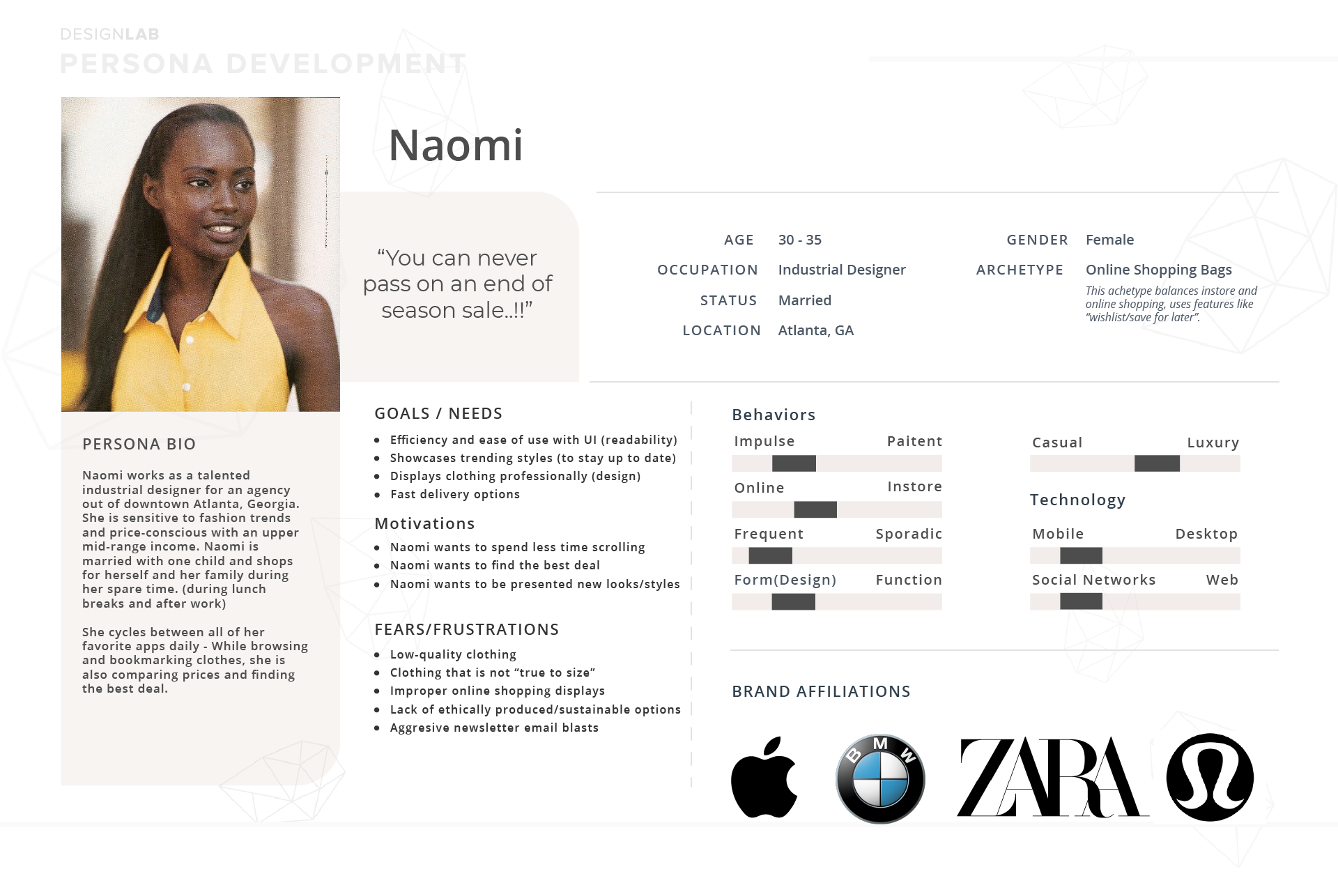
Persona: "Naomi" is a realistic representation of Mirror's key audience segment for an online shopping experience.
Information Architecture
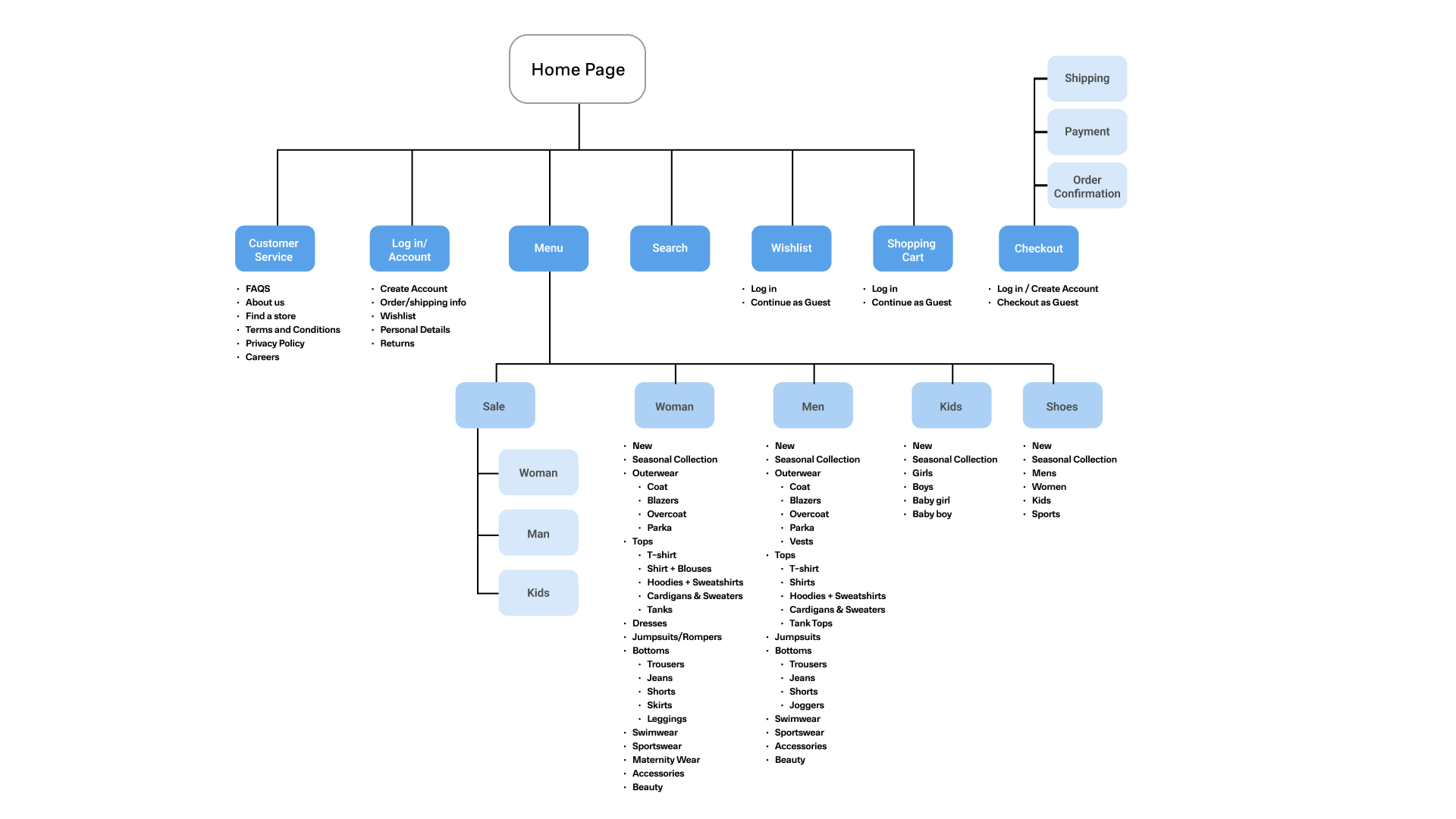
To develop a better framework for Mirror's website, I began building the site's information structure to dictate my design decisions based on user feedback up to this point.
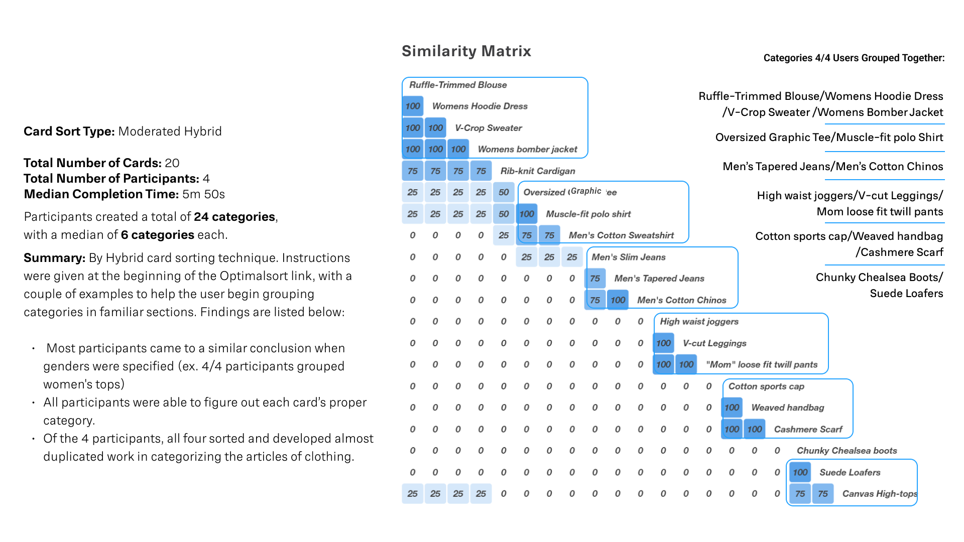
Card Sorting: I used OptimalSort.com with four participants based on clothing categories (i.e., Womans Tops, Men's Bottoms, Shoes, etc.) I discovered the info below on categorizing certain items together for efficiency while shopping.
Sitemap: Created with competitive analysis, 1-on-1 interviews, and card sorting exercises considered
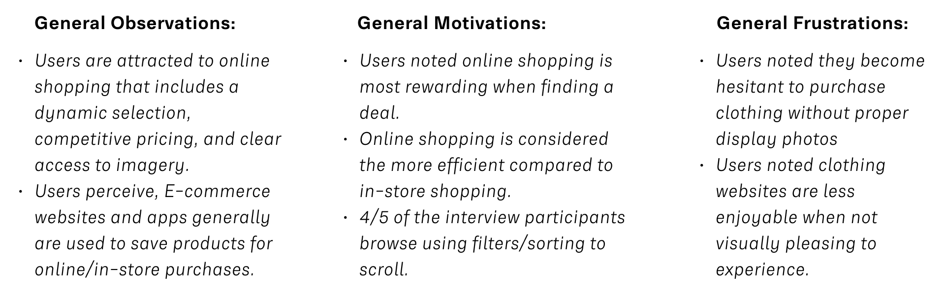
Research Insight
Users' online shopping experience is highly affected by the website's display & visual design. Therefore, ease of use within UI is highly considered by users while browsing.
Participants need to see clothing worn/displayed properly on humans to be comfortable enough to make the purchase.
UI style may vary, but many people don't like to scroll excessively.
Users hold a balanced in-store and online shopping relationship.
The most common feature requested: Interactive Display (VR, 3D, etc.)
Interaction Design
Task Flow, User Flow, Responsive Wireframes, and UI product requirements - continuing my process to develop designed deliverables.
Initial Task Flow: To buy a product and checkout.
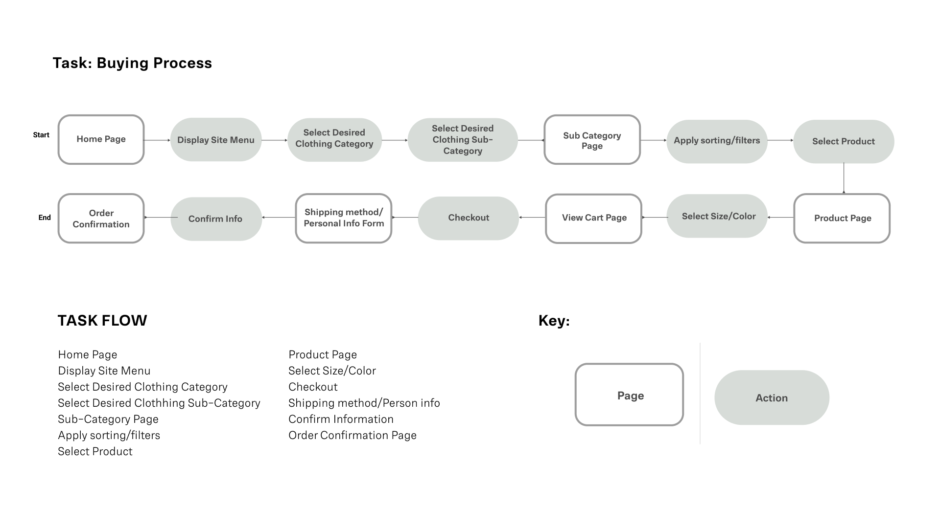
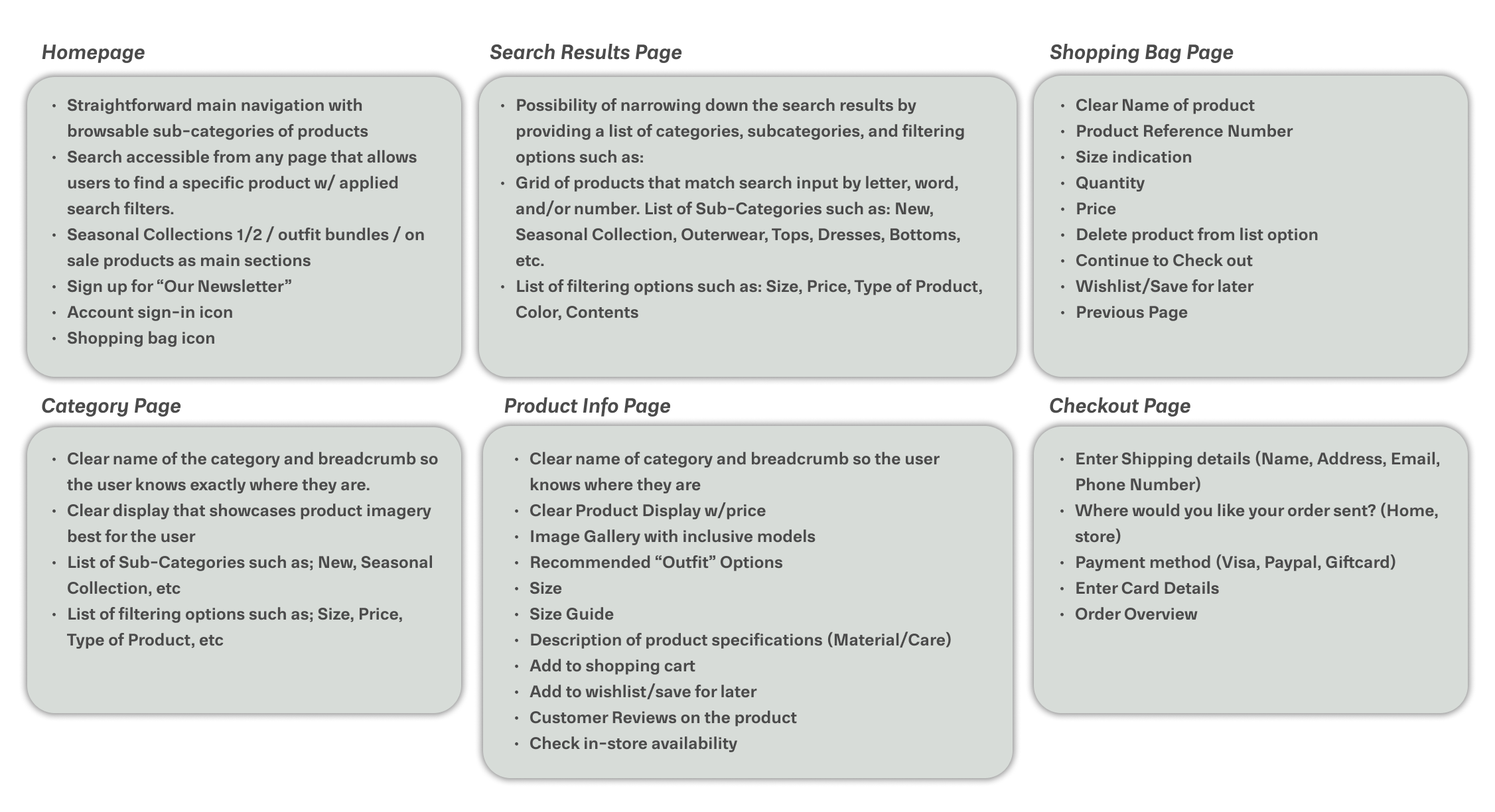
UI Product Requirements: Homepage, Category, Menu, Product Info, Shopping Bag, Checkout.
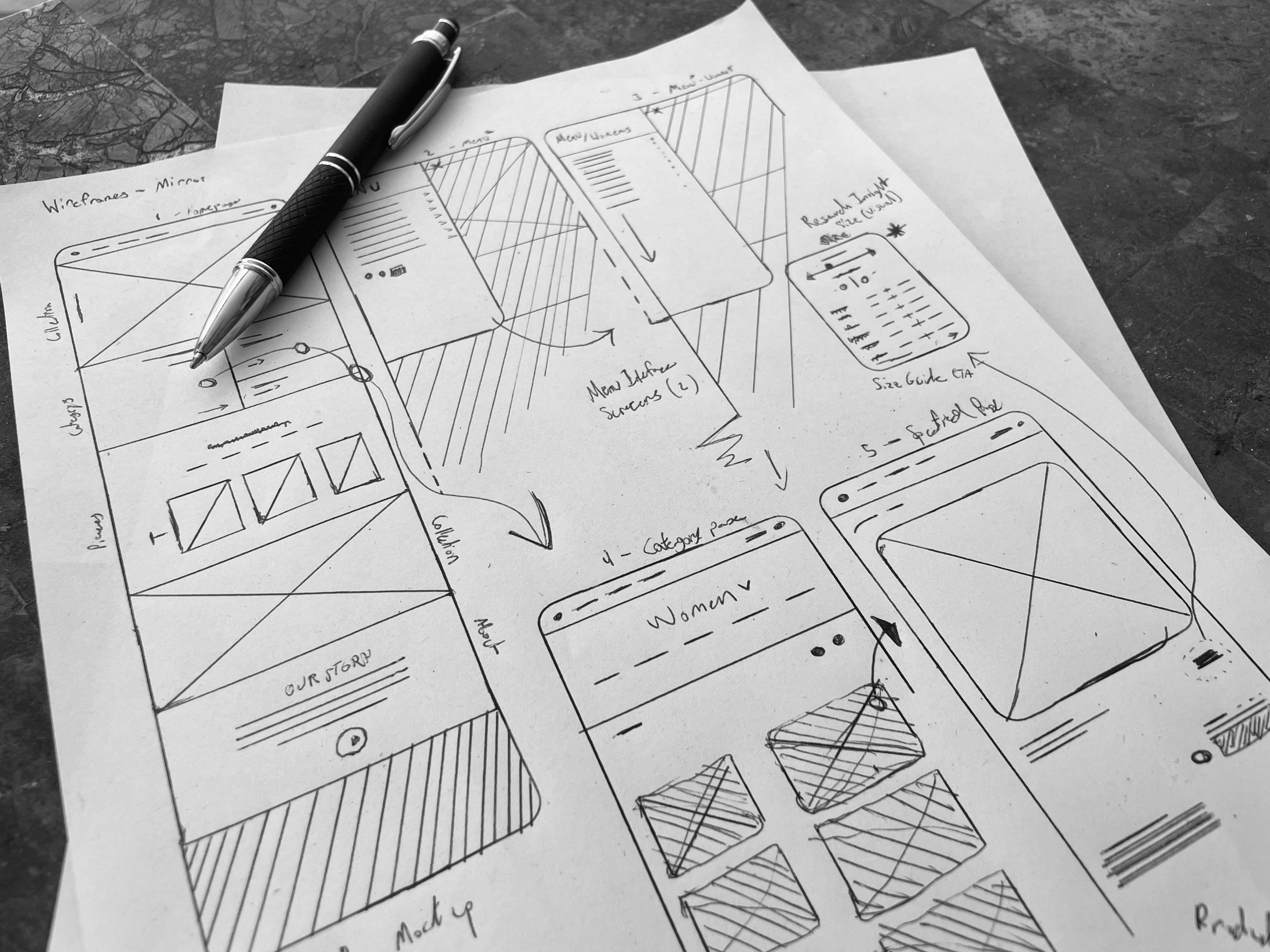
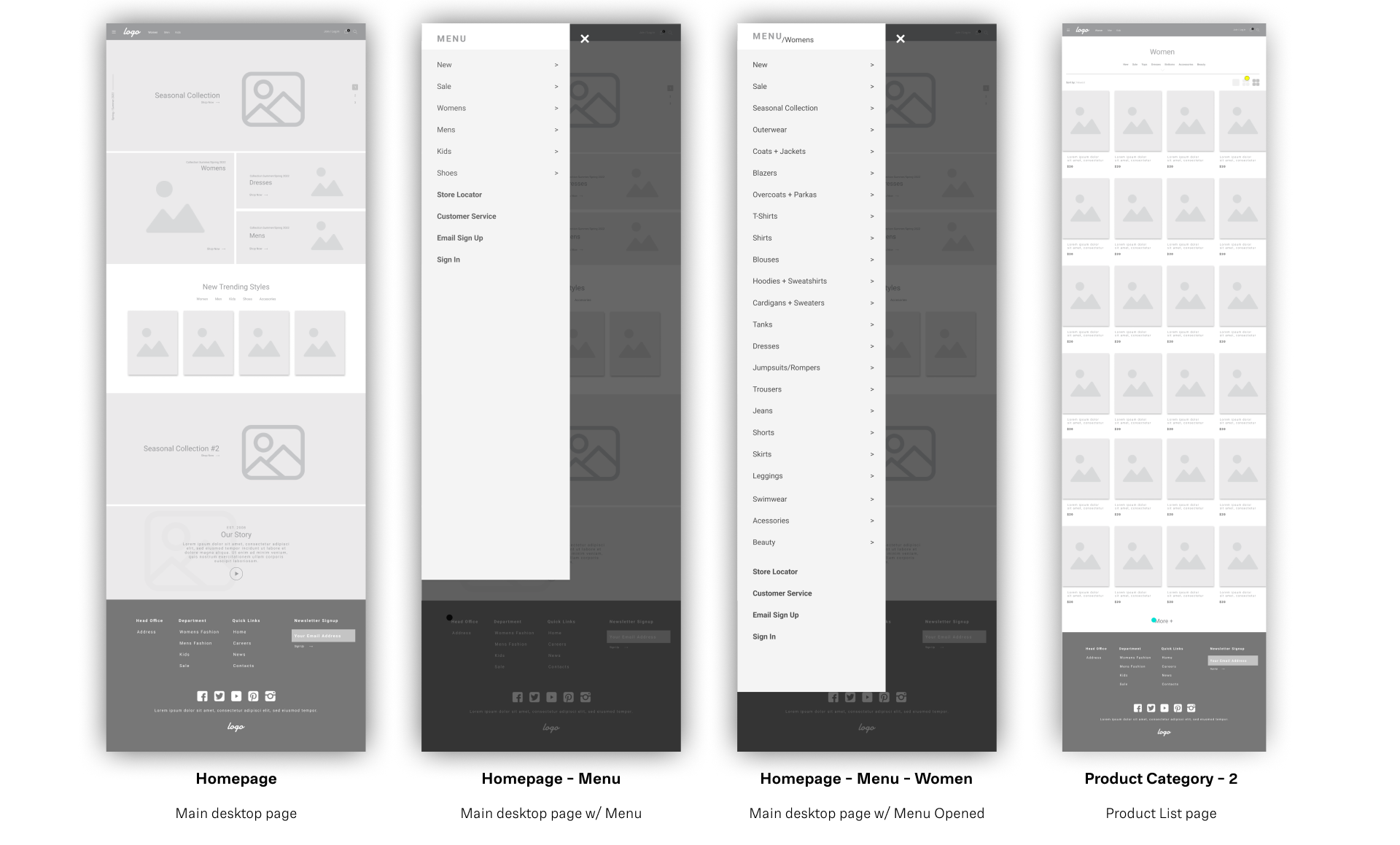
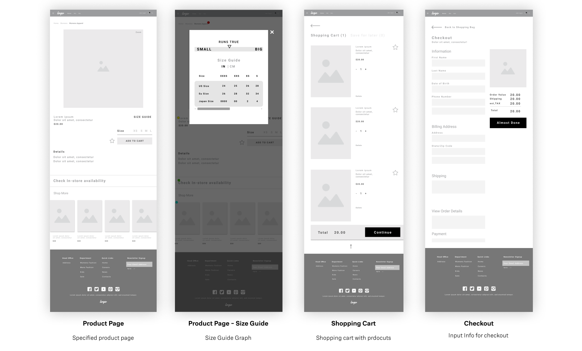
UI Wireframes
Desktop Wireframes developed from revised layout sketches and research. Each page is specifically designed for simplicity; minimal type usage is paired with large display images for ease of use/accessibility.
UI Design
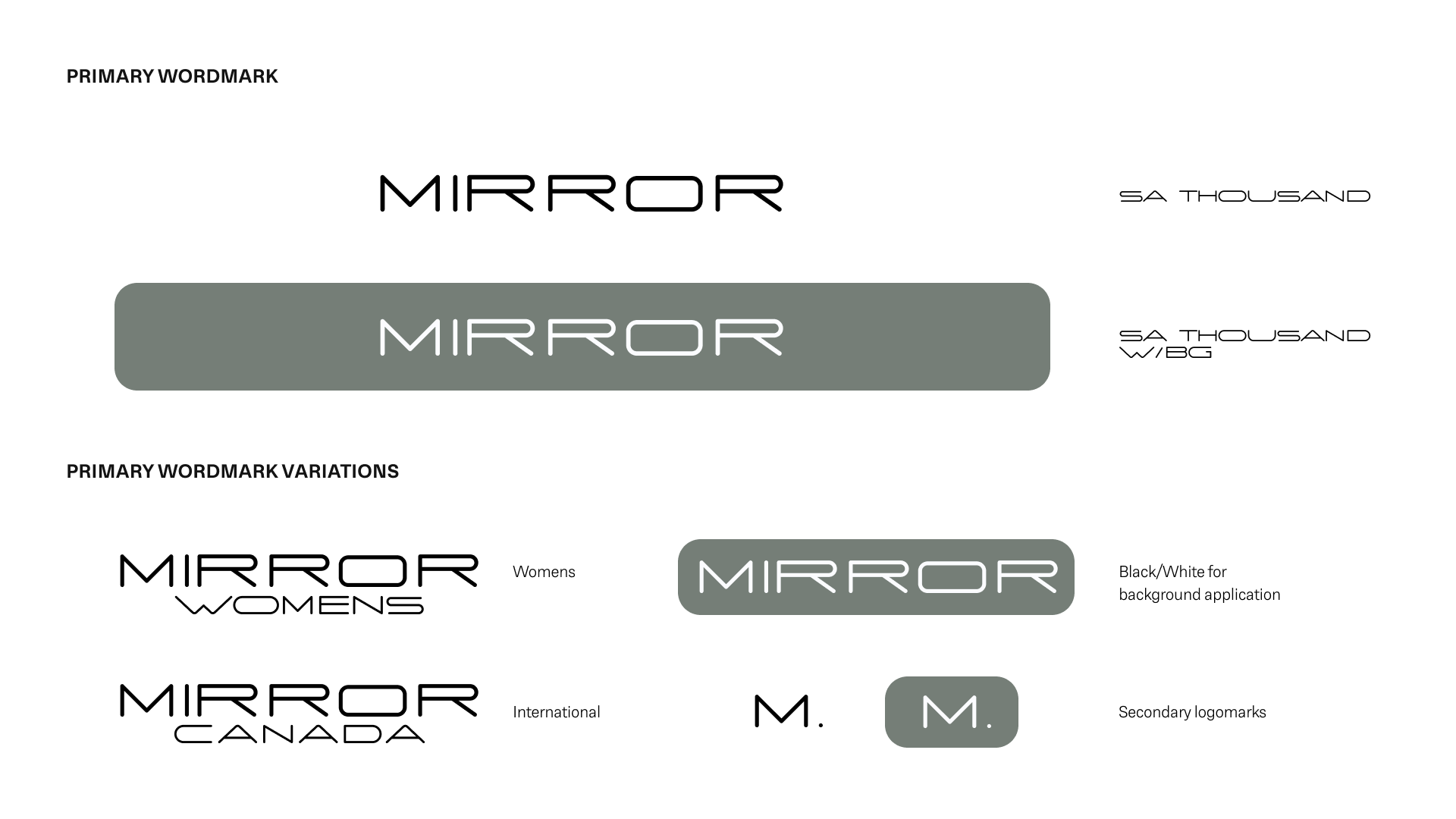
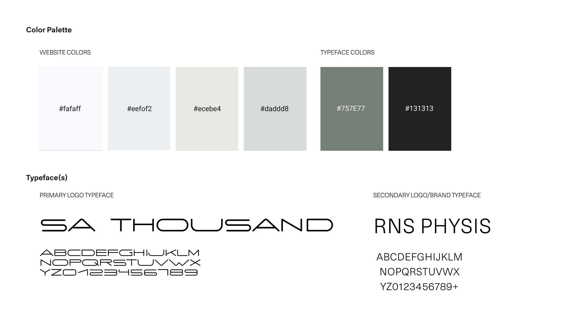
Mirror's visual identity was created once my research began to show user-selected patterns. A modern aesthetic was developed with the project's brief in mind. Clean, Neutral, & Minimal stylization was applied to develop a unique look for the responsive website. Corporate Visual Identity Document

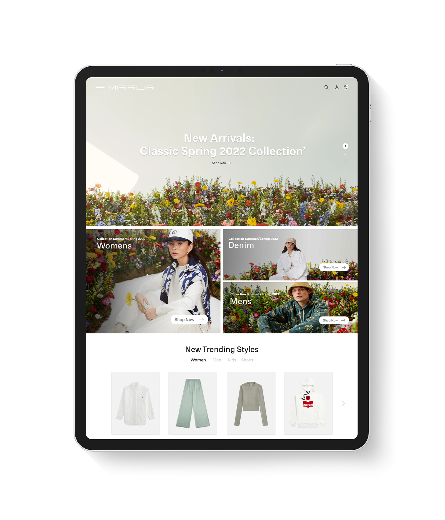
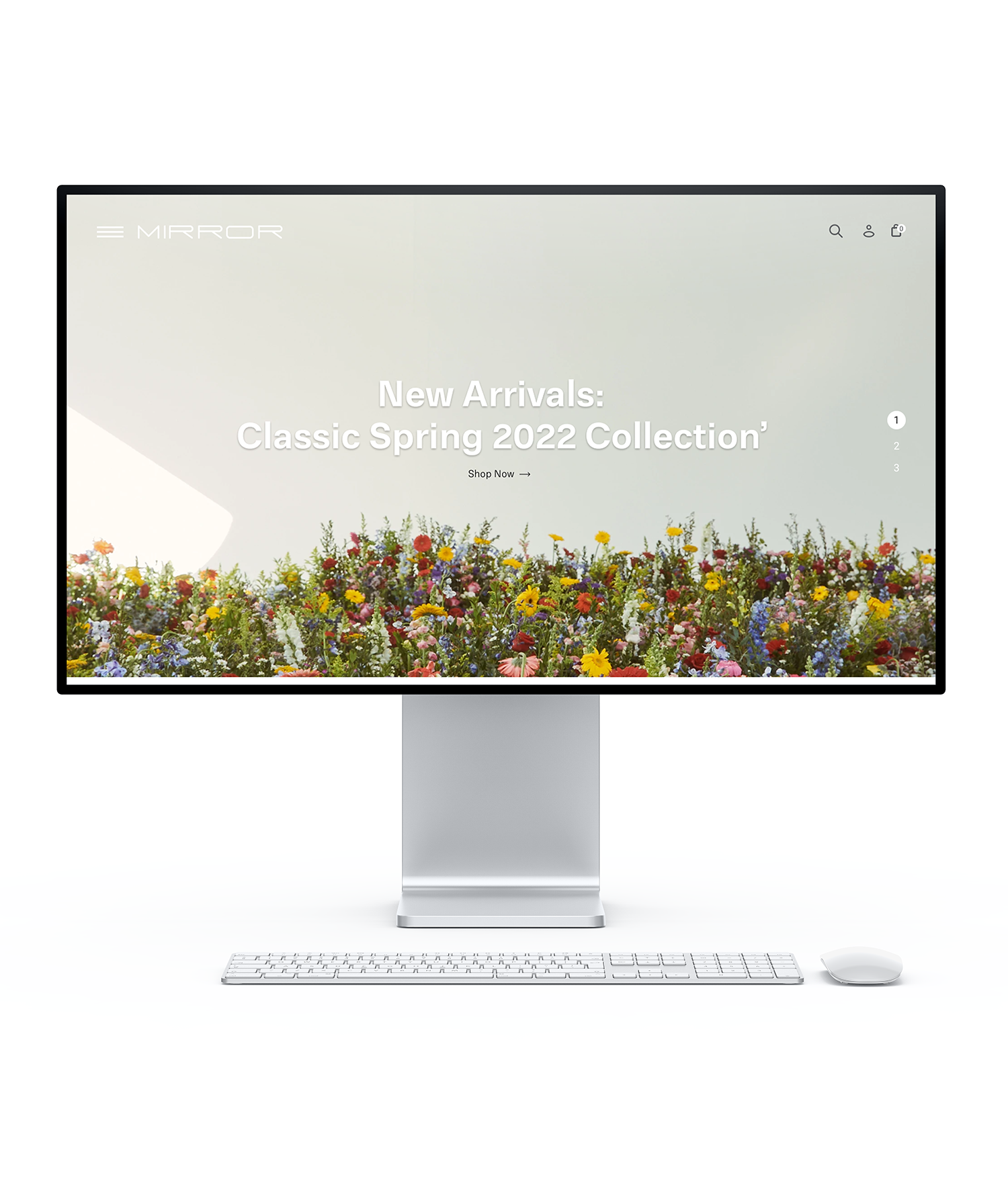
High Fidelity Design (Desktop)
Mirror's landing page displays the website's minimal design style. Modernist San-serif typefaces curate a calm shopping experience - Desktop "Menu" flow shown below:
High Fidelity Design (Mobile)
Mobile UI design developed through wireframes and competitive analysis. Check out Task flow is shown below; the main user flow used to design the site.
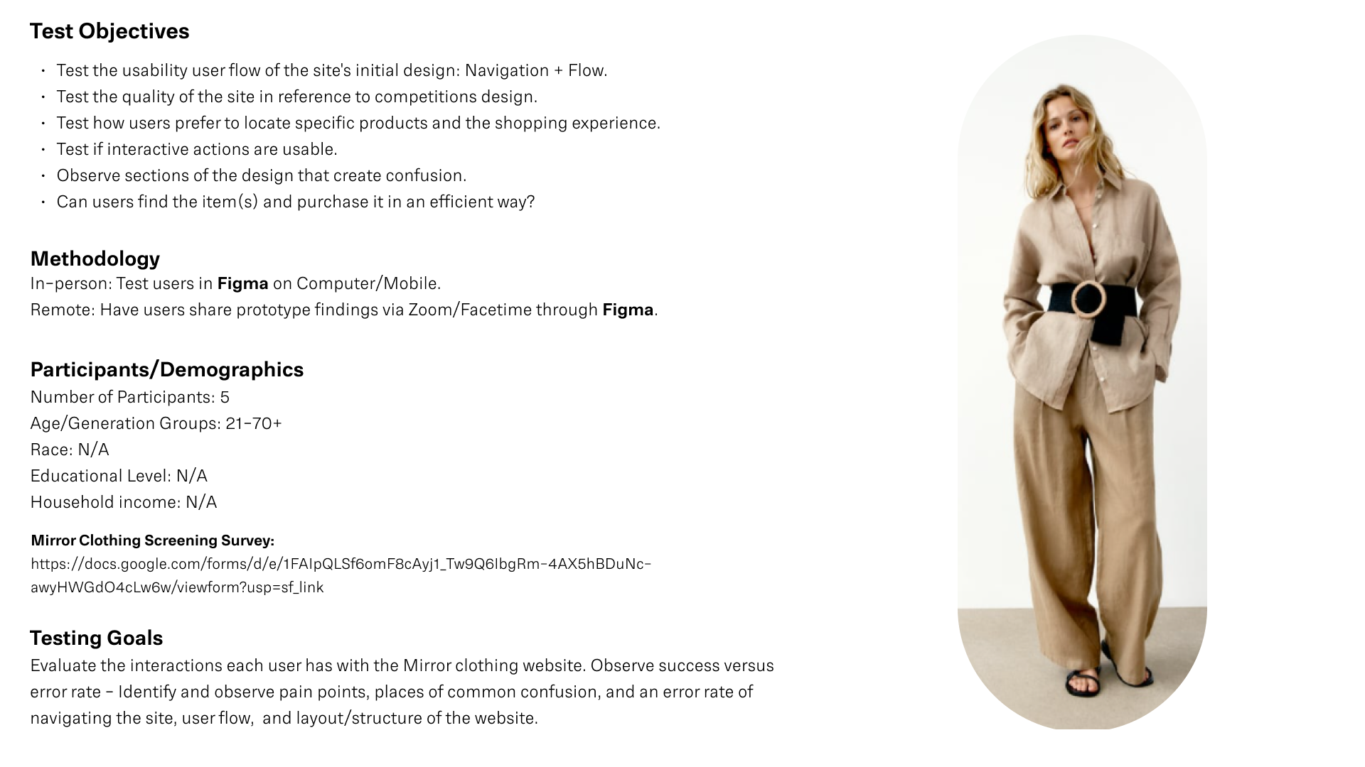
Usability Testing (Desktop & Mobile)
Affinity Map
Below I have the recorded outcome of the observations I made during testing Mirror's usability and readability. Assisting me in understanding how the website is interacted with and noting pain points from different users.

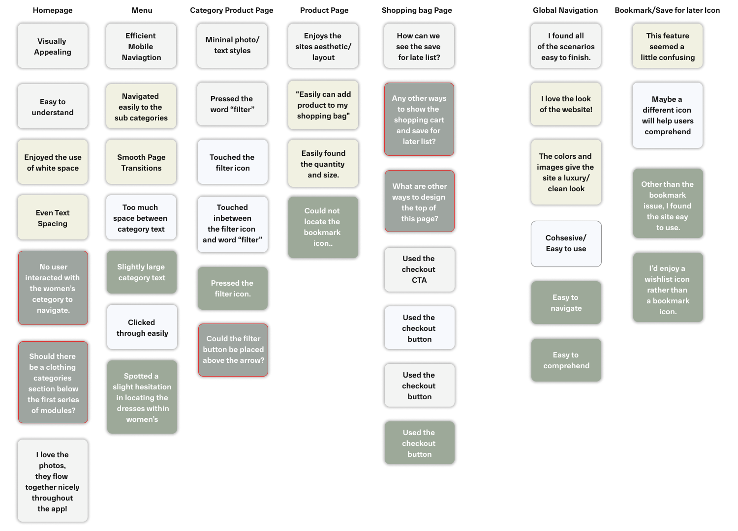
Usability Insight
Home Page
None of the users used the "women's category" to navigate - I do not believe this is an issue/paint point, but I would like to create more entry points for accessing the numerous clothing categories on the website. Also, rather than being able to scroll through individual items on the homepage, I believe a way to delegate menu usage would be to place a section to scroll through the website's different categories.
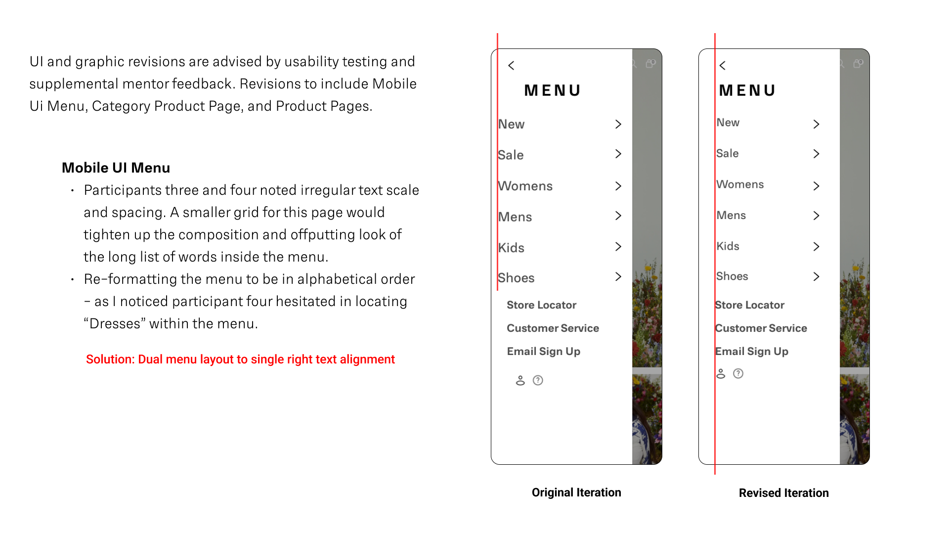
Menu
Participants three and four cited irregular text scale and spacing. A smaller grid for this page would tighten up the composition and off-putting look of the long list of words inside the menu. Re-formatting the menu to be in alphabetical order - as I noticed participant four hesitated in locating “Dresses” within the menu.
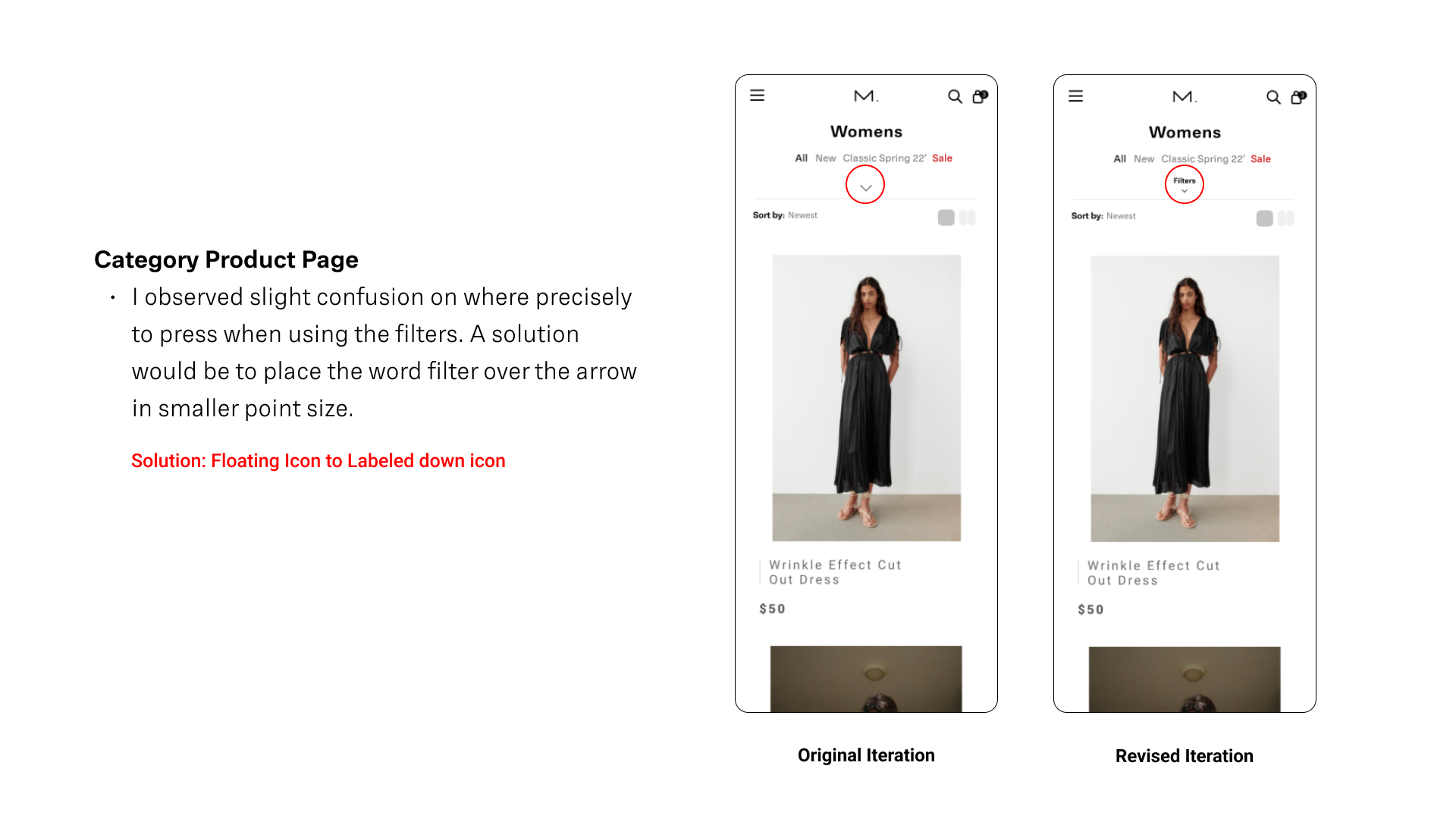
Category Product Page
I observed slight confusion on where exactly to press when using the filters. A resolution would be to place the word filter over the arrow in smaller point size.
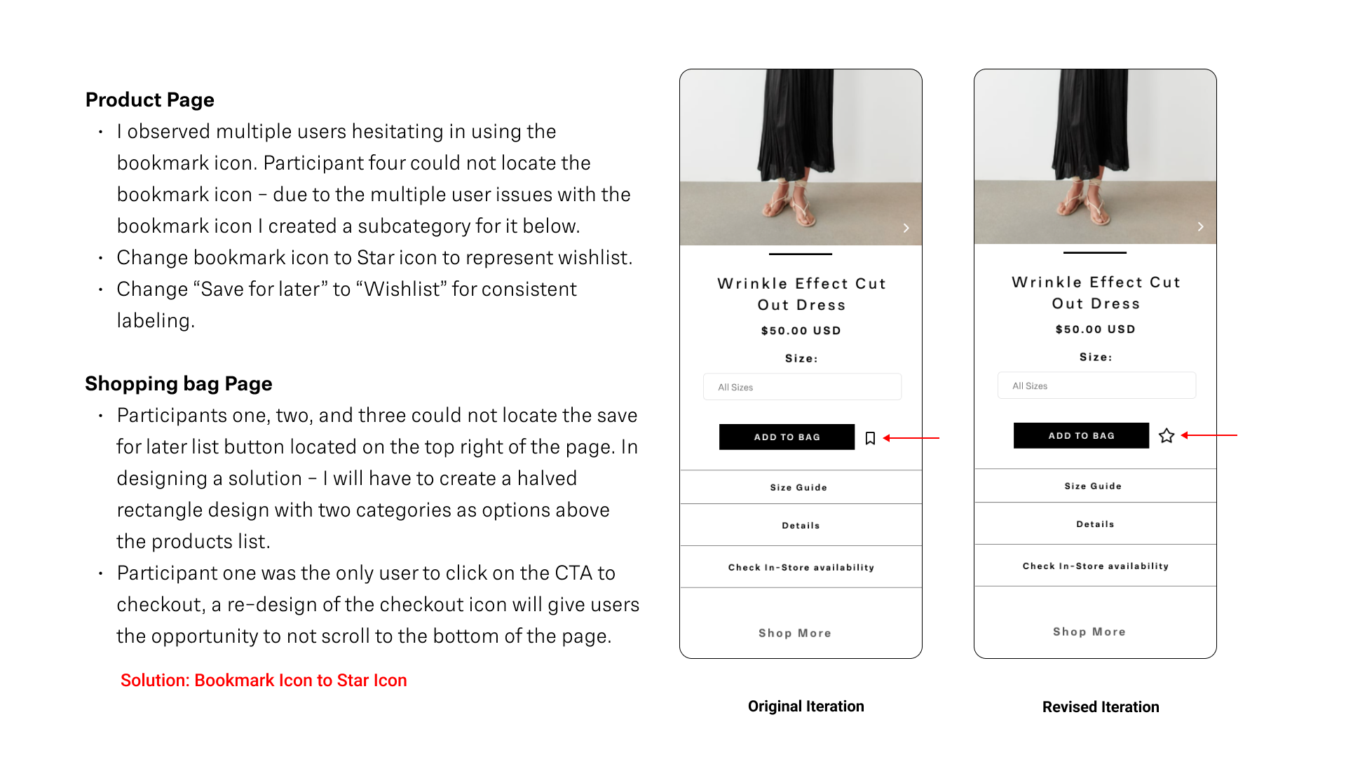
Product Page
I observed multiple users hesitating in using the bookmark icon. Participant four could not locate the bookmark icon - due to the multiple user issues with the bookmark icon; I created a subcategory below.
Shopping bag Page
Participants one, two, and three could not locate the save for later list button on the page's top right. In designing a solution - I will have to create a halved rectangle design with two categories as options above the products list. Participant one was the only user to click the CTA to check out. A re-design of the checkout icon will allow users to not scroll to the bottom of the page.
Bookmark/Save for Later Icon
Change the bookmark icon to the Star icon to represent the wish list. Also, revised “Save for later” to “Wishlist” for consistent labeling.
View Prototype
Walk-through the mobile website here.
User tasks include: "Purchase a Dress" / "Filter your clothing options"
Revisions
Conclusion
In conclusion, designing a responsive website is a skill set to be mastered with constant practice. In finalizing this project, I found successful ways to display product photography in a clear and engaging way for the user. Hopefully, motivating the person to make a purchase. If I had more time to dedicate to this project, I would consider working on the following:
- Revise product display page with multi-media viewing options: Interactive Design.
- Develop Men's, Kids, and Shoe clothing category pages.
- Observe/Test more users to develop revisions for more efficiency.
Mirror Case Study - PDF
Thank you


