


UX/UI - Product Design - Graphic Design
Designlab
2022
Scope and Focus
An end-to-end mobile application that connects a network of EV charging users to stay up to date on local charge station information and have peace of mind when searching for EV charging stations nearby.
High-Level Design Goals and Objectives
To observe electric car owners charging experience to design a mobile application in a visually stimulating & usable way, best for the desired EV user. Defined key app elements; Locating, navigating, researching, and utilizing the application.
Defined Deliverables
Observe EV ownership experience concerning public chargers to identify potential main user flows/tasks.
Understand the primary potential user. (What persona would likely be using this app and what for?)
Design digital resolutions based on pain points directly observed.
UX Research Methods
Comparative and Competitive research to observe how competitors offer charge station details within the app store.
Moderated Usability Testing to understand what customers desire from the public charger station mobile experience.
Customer Interviews to learn how users interact with their preferred public charge station app.
Identified user interview synthesizes and visualize patterns to understand what users desire from the digital public charging experience.
Research
Electric cars are becoming more popular as you’ll frequently find new and used EVs populating most significant cities & suburbs — although they’re easier to buy in some states than others. EVs are part of a new wave of environmentally aware consumers in need of transportation.
EV charging stations can be a little harder to spot, with an estimated 100,000 chargers available at 28,000 charging stations in North America. This is far lower than the number of public gas stations in the U.S. — The good news is that electric vehicle charging infrastructure is increasing rapidly. But how will new owners know where to find these new charging stations?
What is the problem? According to research, one of the most significant barriers to EV adoption in the U.S. is the charging infrastructure. Finding a charger wasn’t a problem it was the time it took to get a full charge. It takes about 10 minutes to fill your car with a tank of gas but about 45 minutes to fully charge an EV, sometimes longer. The app you use should resolve these pain points, giving you ways to avoid issues.
Why does it matter? If electric cars are the future of the American roadway, EV charging infrastructure should also be prioritized. Corenav will assist the public with a smooth transition; that is ready for scale once the manufacturers begin to only sell EV vehicles.
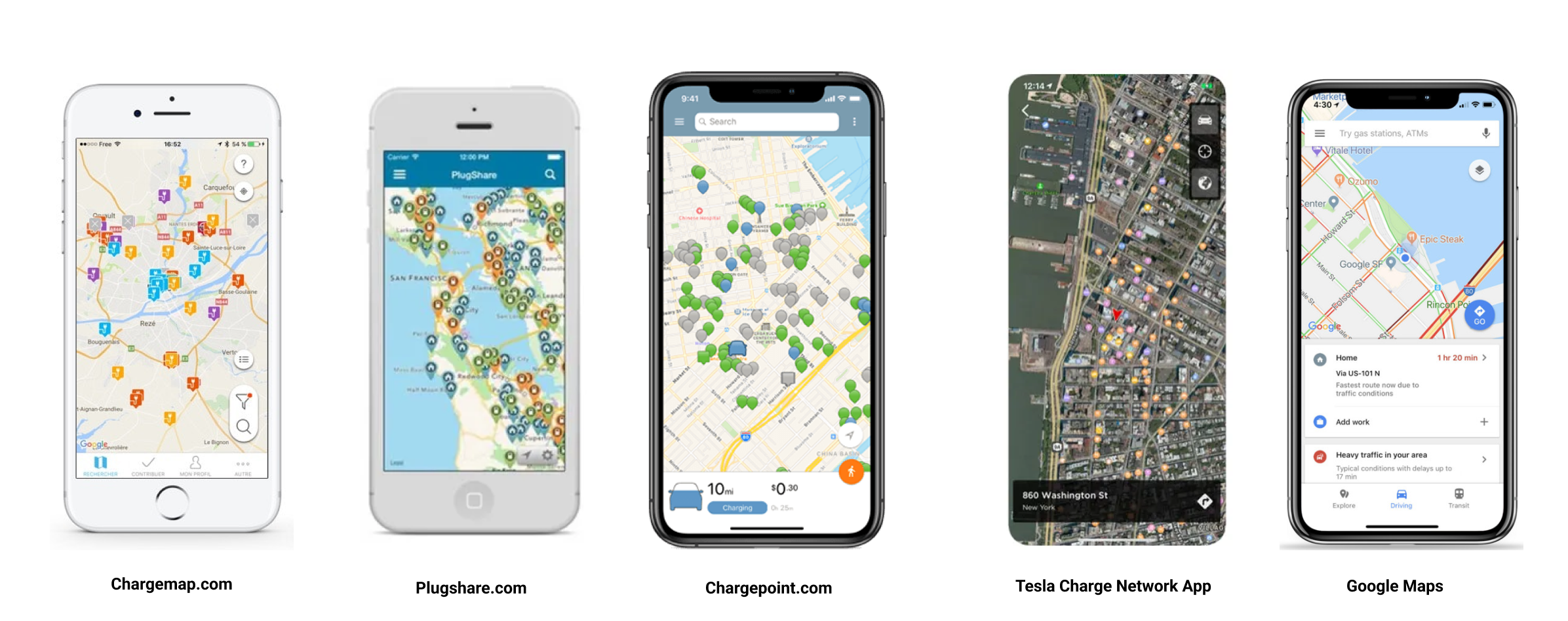
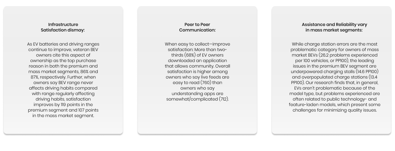
Competitive Analysis:
I began my research by examining EV charging apps focusing on different core competencies in the app store. I then analyzed the market's most popular EV charging apps to develop strengths, weaknesses, and growth opportunities.
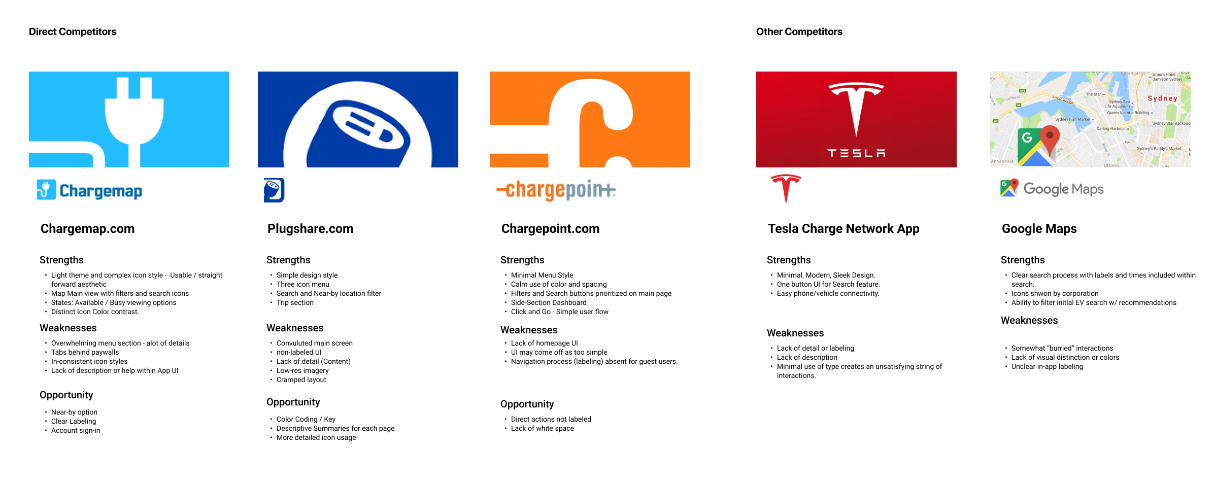
Research show that 58% of Americans fear range anxiety and 49% fear being unable to find a charging station. These apps are resources to providing drivers with insights addressing such concerns. According to The New York Times, “For Electric Car Owners’ Range Anxiety Gives Way to ‘Charging Time Trauma,'” Americans are becoming more concerned with long charge times than the inability to find a charger. Here are my key takeaways from my research:
User Interviews
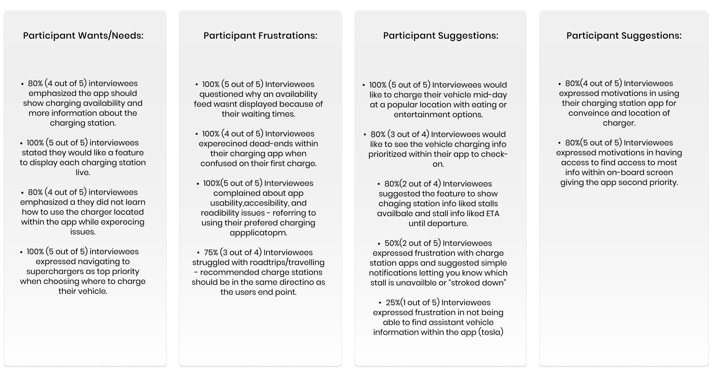
User Vehicle & Application Interactions:
Four out of Five participants commented initially that usual charge times ranged from 30 to 50 mins long; these long times are frustrating compared to gas vehicle counterparts, and focus should be placed on what users can do/where they can be while the vehicle is charging.
Common Personal solutions such as becoming more aware of specific info or directly asking other tesla owners were necessary for the user to manage in their EV charging experience.
Five out of Five participants noted they only go to high volume charging stations ranging from 150Kw and up.
Five out of Five participants experienced issues at a higher rate when road tripping (traveling).
Define
Understanding the User
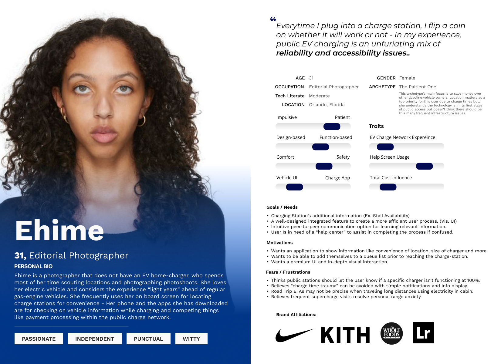
Based on my research, product goals, and MVP, I focused on one primary user of the EV charging experience - Ehime the Patient one.
I defined this persona based on prioritized motivations and pain points discovered from my initial research. After my interviews, I observed issues experienced by the majority. With this insight, I decided only to develop one persona to truly understand how I could design more intuitively for common problems.
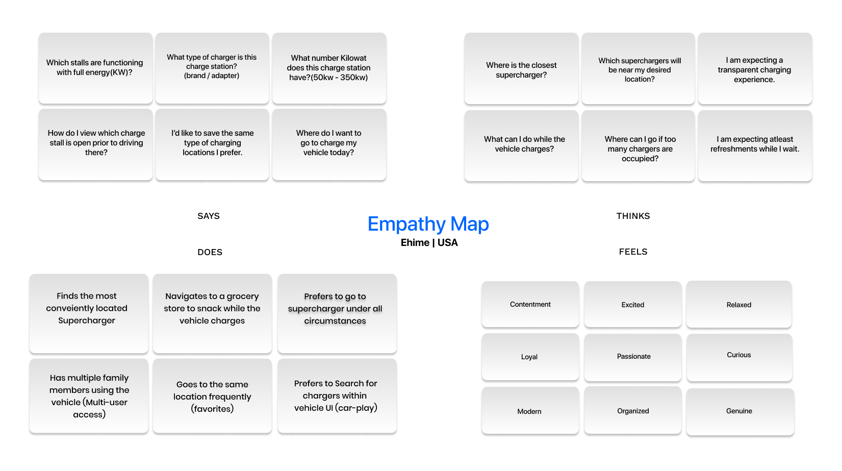
Persona & Empathy Map:
Insights from the research phase were synthesized into a user persona to better empathize with probable users.
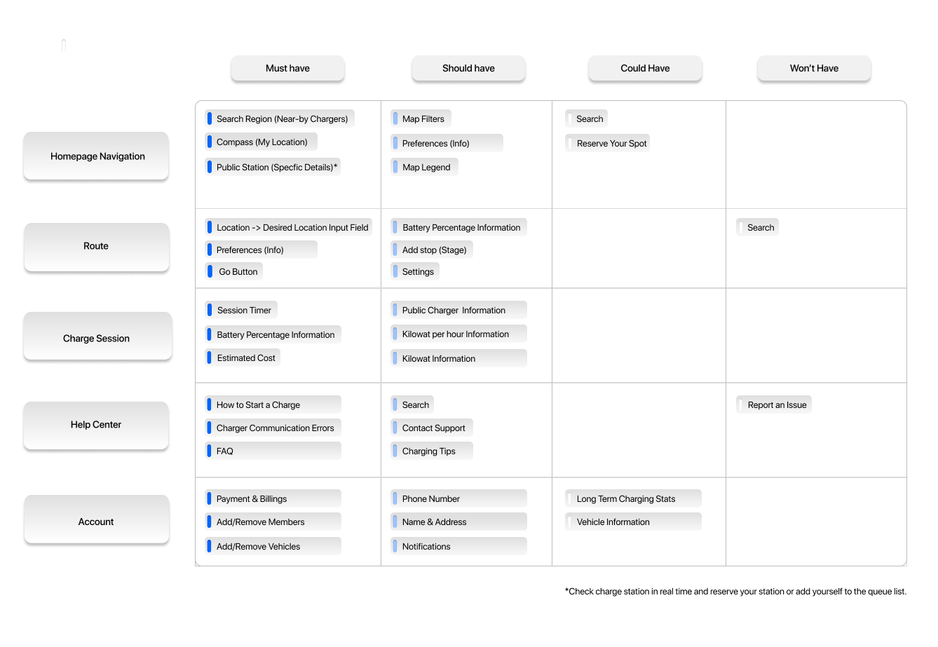
Feature Prioritization Matrix:
By understanding the users’ motivations, needs, and frustrations; I began developing key features to prioritize the app within the development phase. As a result, the MVP developed should address the basic need of the app's function and inspire the community through credible/usable content.
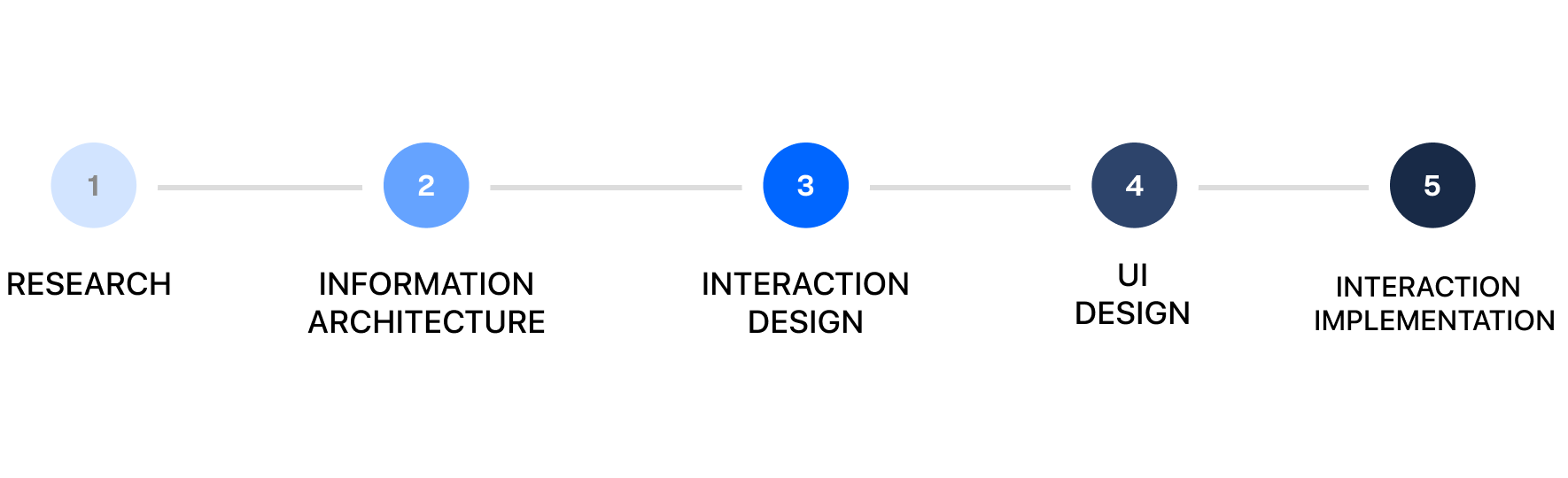
Information Architecture
Screen Sitemap, User Flow, Customer Journey, Responsive Wireframes - process to develop high fidelity deliverables.
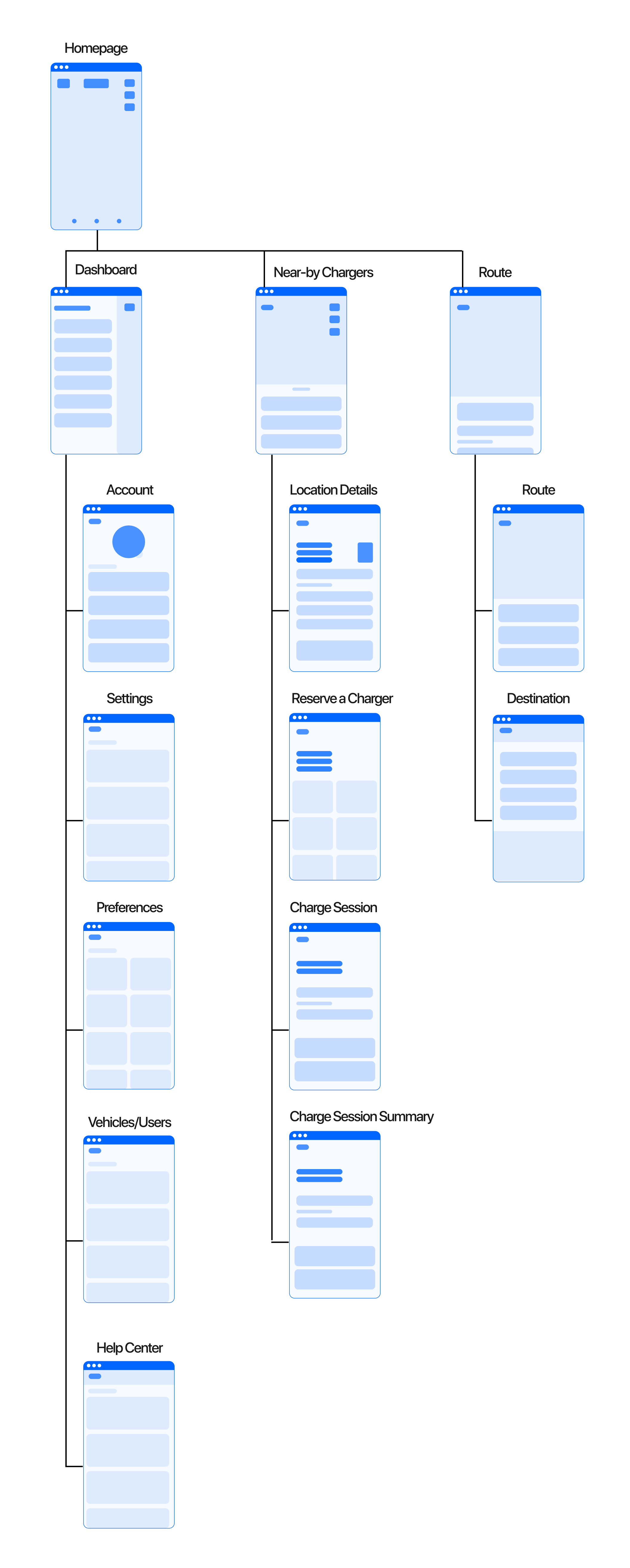
Screen Sitemap:
A sitemap was designed at the point in my process to obtain precise information on organization and architecture, the depth of the project, as well as the potential roadmaps for any user to complete their desired tasks.
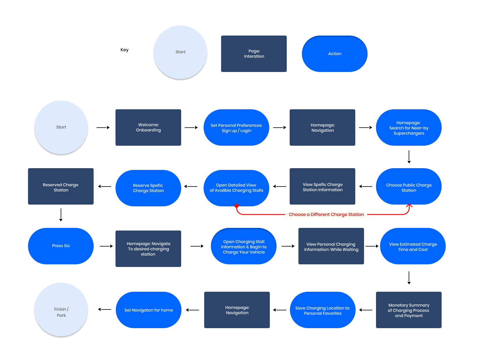
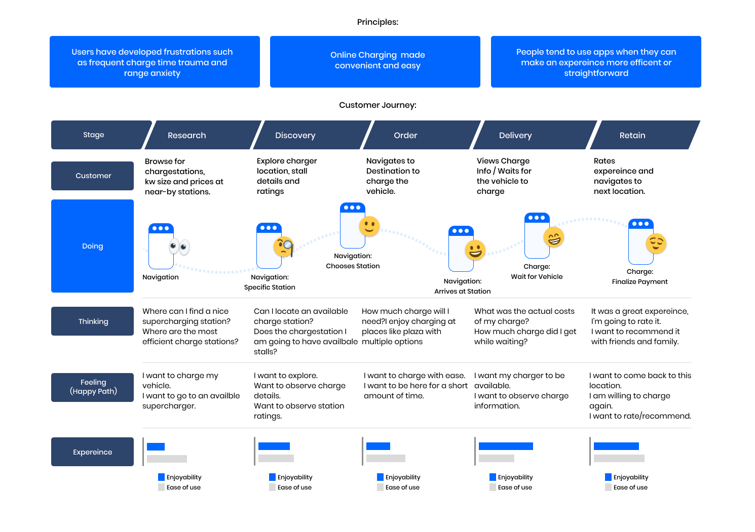
User Flow & Customer Journey
Through the date collected, I created a user flow that goes from opening the app for the first time to interacting with the app's core user flows, finding a nearby charger and checking to see if it's available.
Mid Fidelity Wireframes
I began with sketches and iterated until I could design low-fidelity wireframes to visualize the app's flow on different pages. The goal is to focus on navigating nearby EV chargers to discover and interact with charge station information to make a final decision.
The touchpoints for each task given were designed to create a clean and straightforward navigating experience. Next, working within the framework of the grid, I began to implement an icon set, layout, design pattern, and copy to my wireframes.
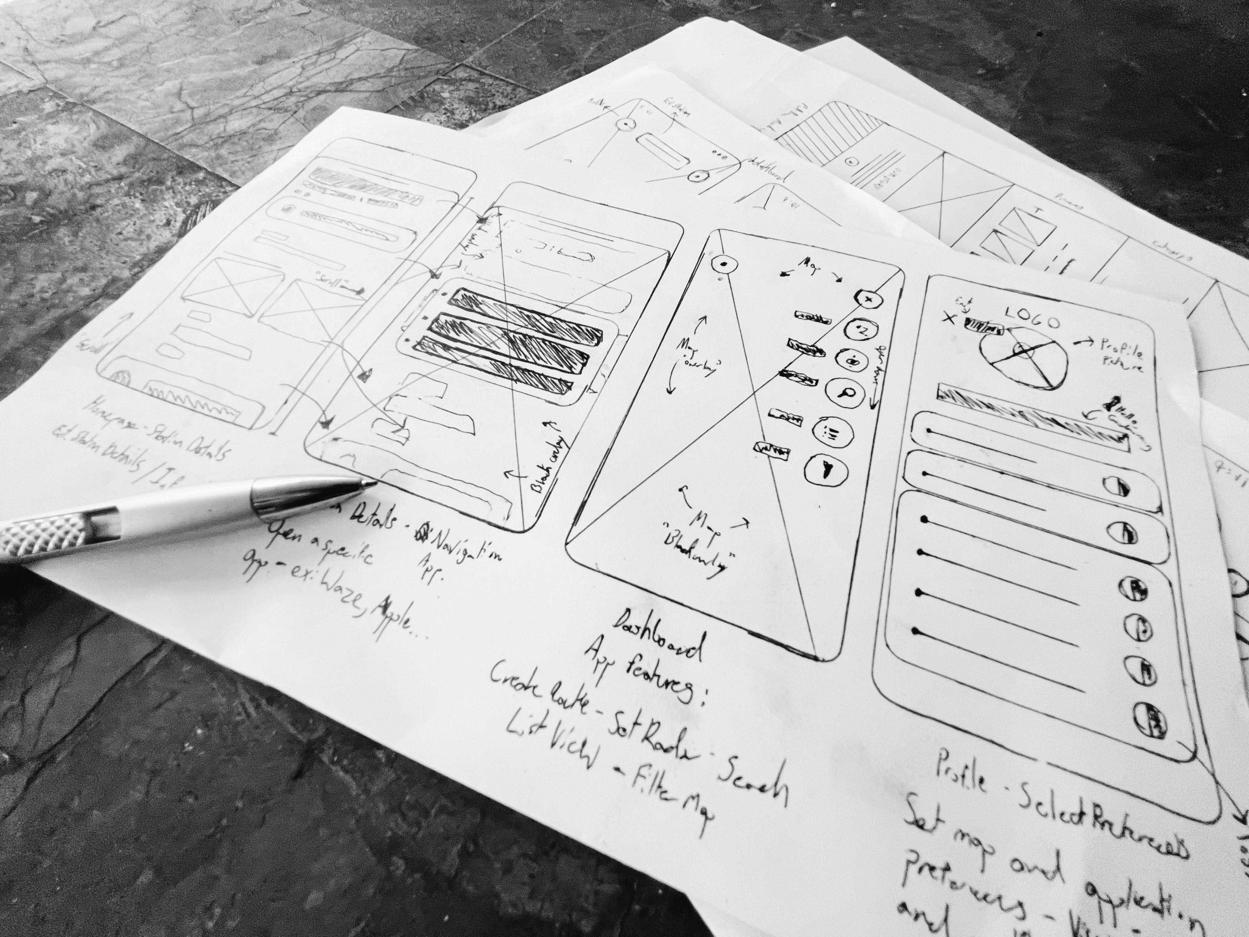
Open Mid-fi wireframes: Here
Brand Identity
After designing the wireframes for the application, I began the UI process by delving into a modern brand identity that would visually mesh with the persona's digital expectations. The direction should encapsulate the following:
Modern / Minimal / Usable / Community-Driven / Gender neutral
Applying UI To Wireframes
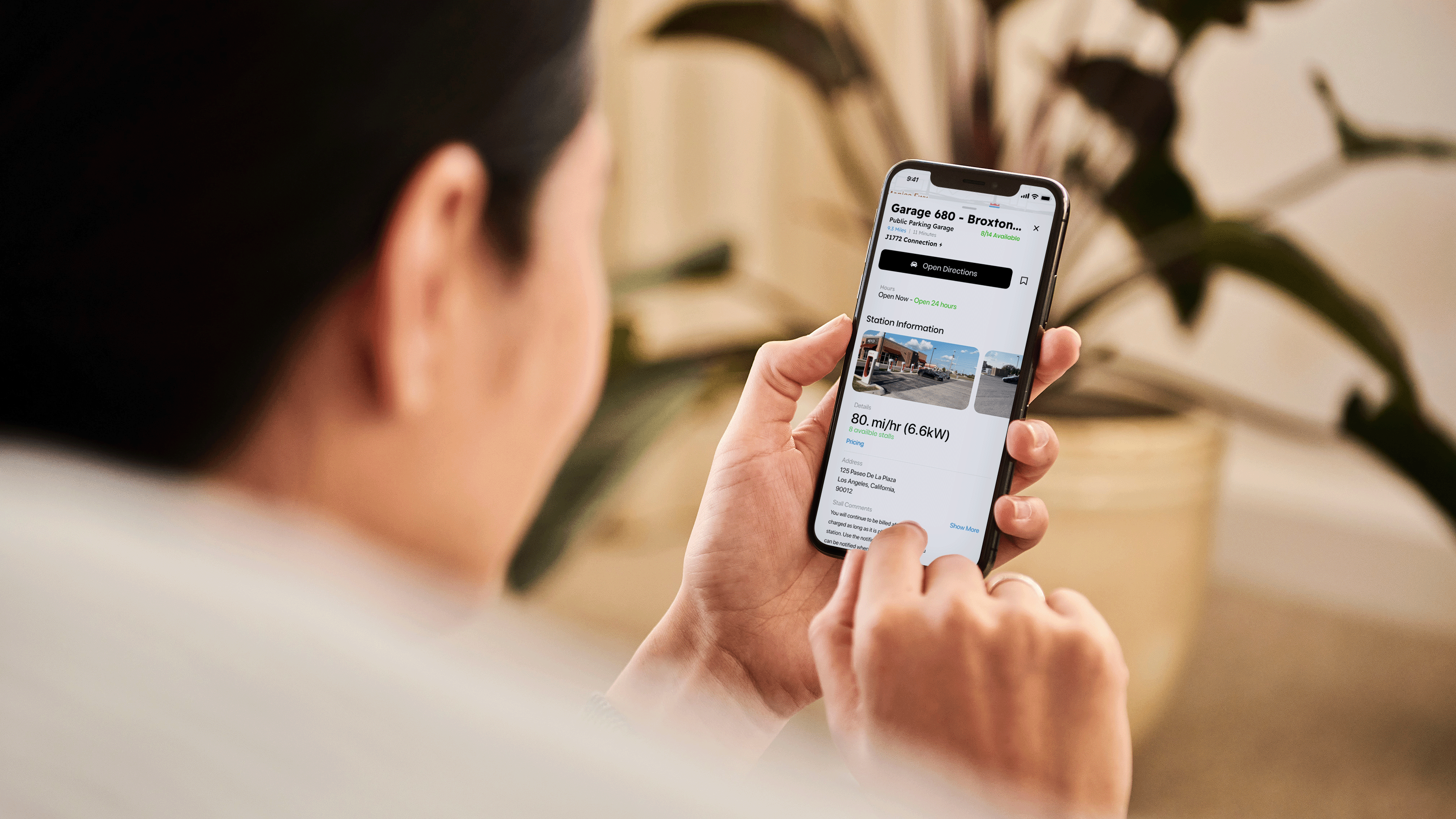
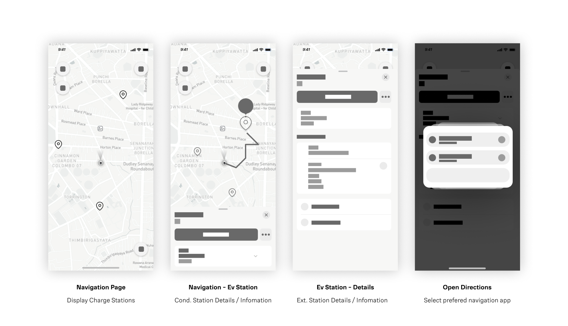
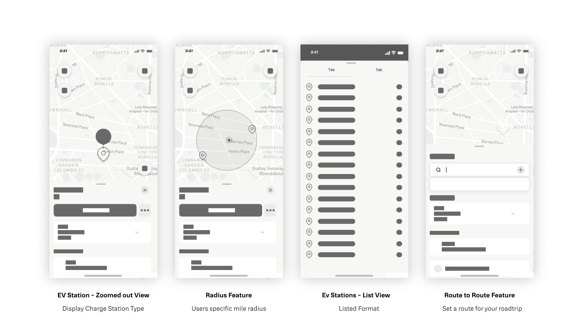
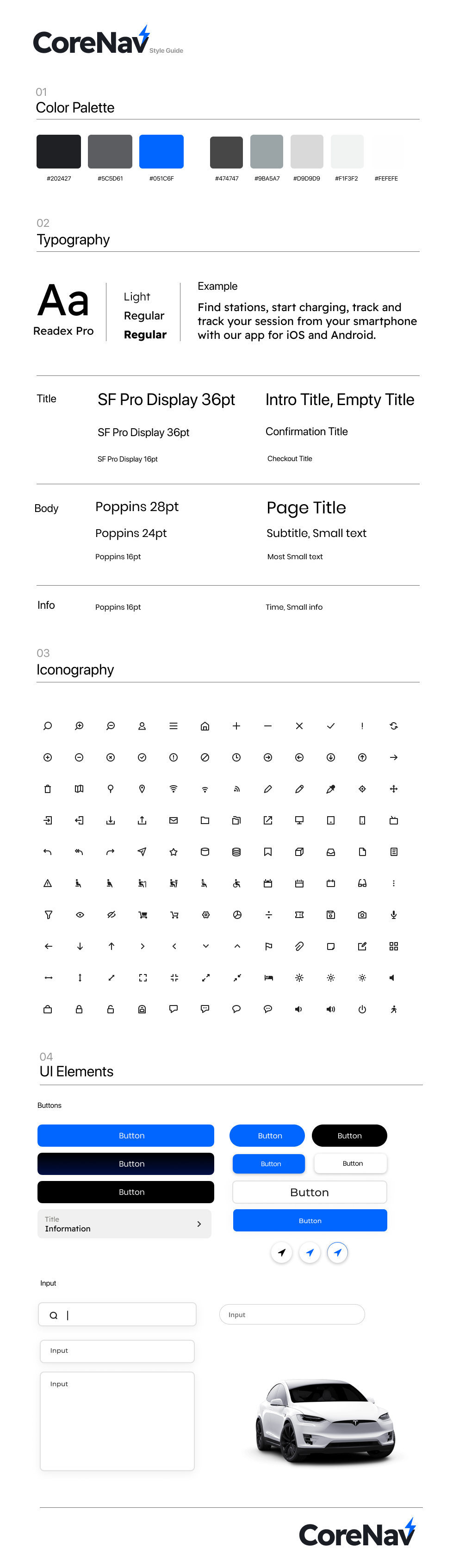
After establishing CoreNav's brand identity and UI kit, visual elements were able to be developed for a minimal, easy-to-use app.
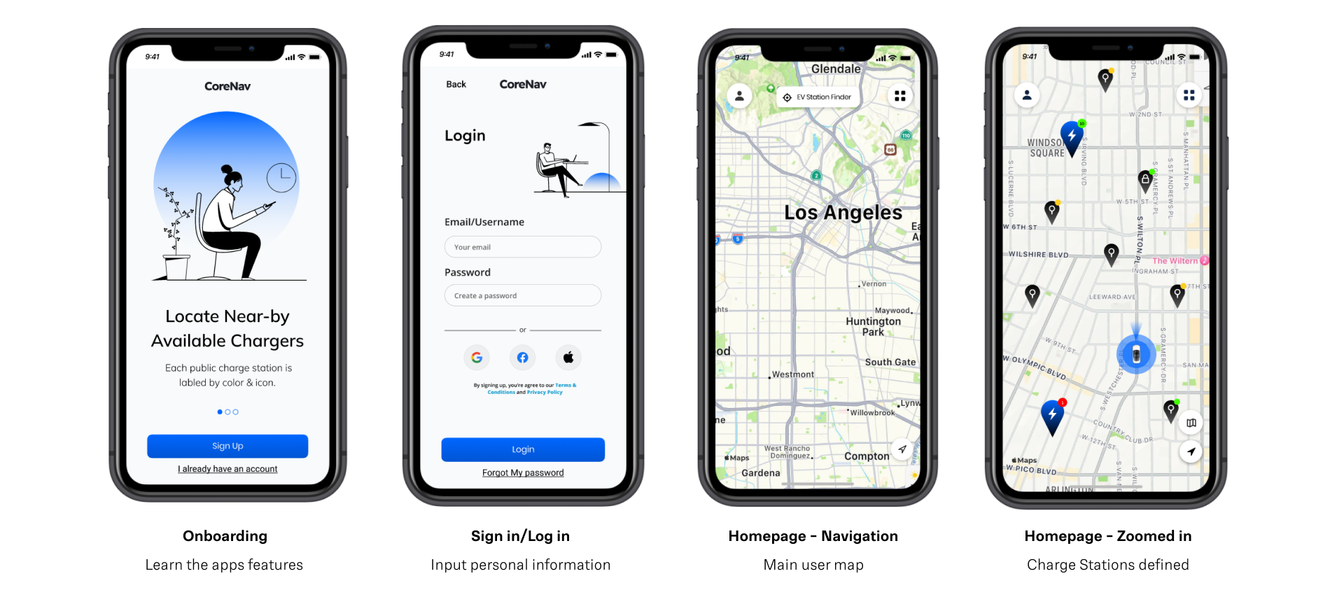
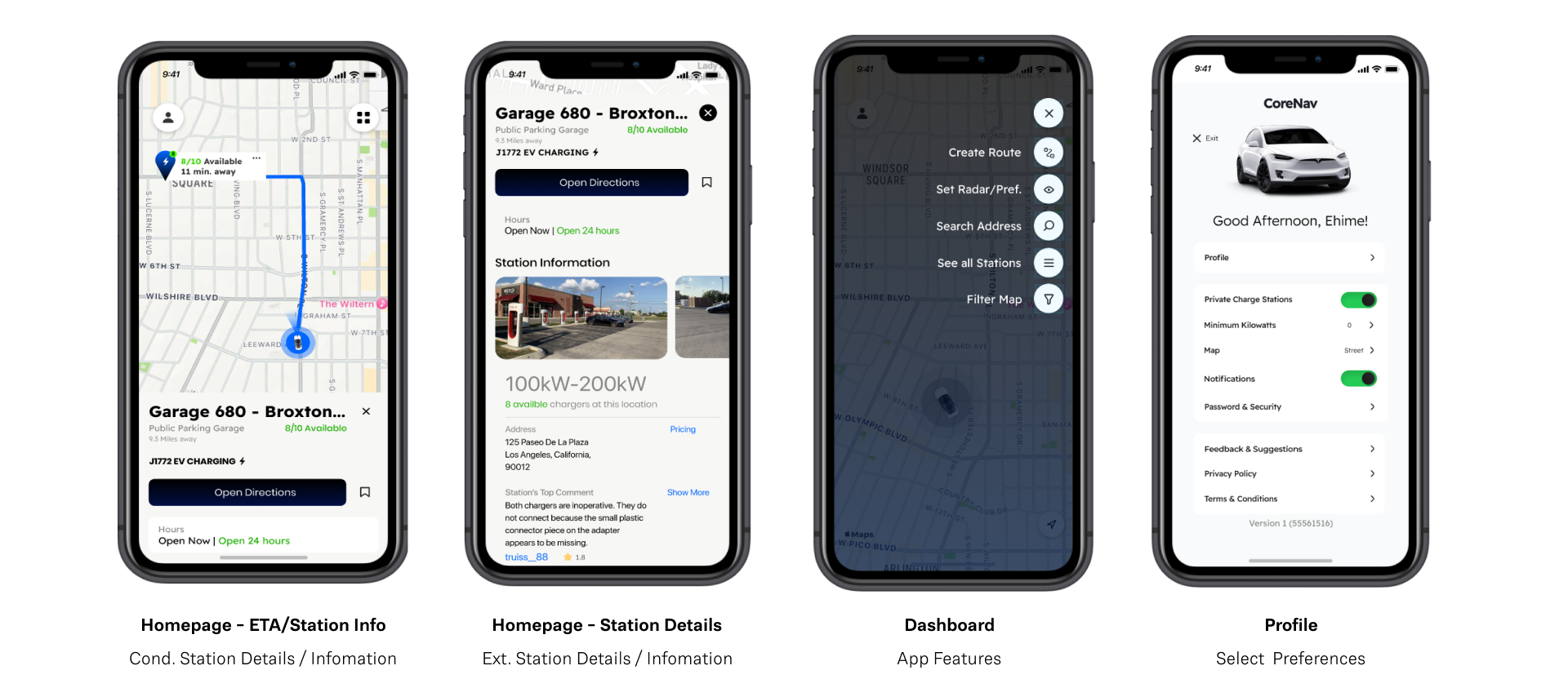
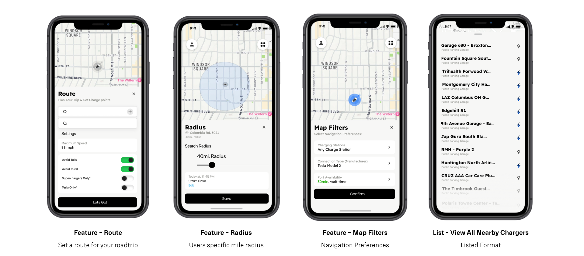
Below are essential screens from the first version of the CoreNav mobile app. Users start with searching for a nearby charger, locating and delving into the charge stations details, and finally using the dashboards features
Testing
High-Level Objectives
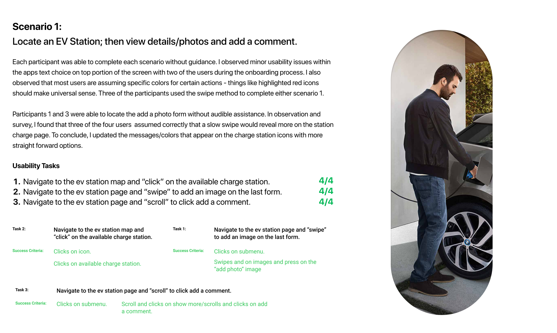
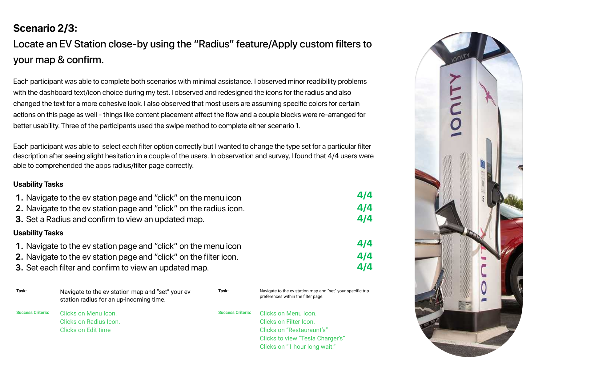
- Test the usability/standard user flow of the app's fundamental design
- Test the quality of the site against the competitor's design.
- Test how users prefer to locate distinct features within the locating and navigating experience.
- Test if interactive actions are usable and MVPs are resolved.
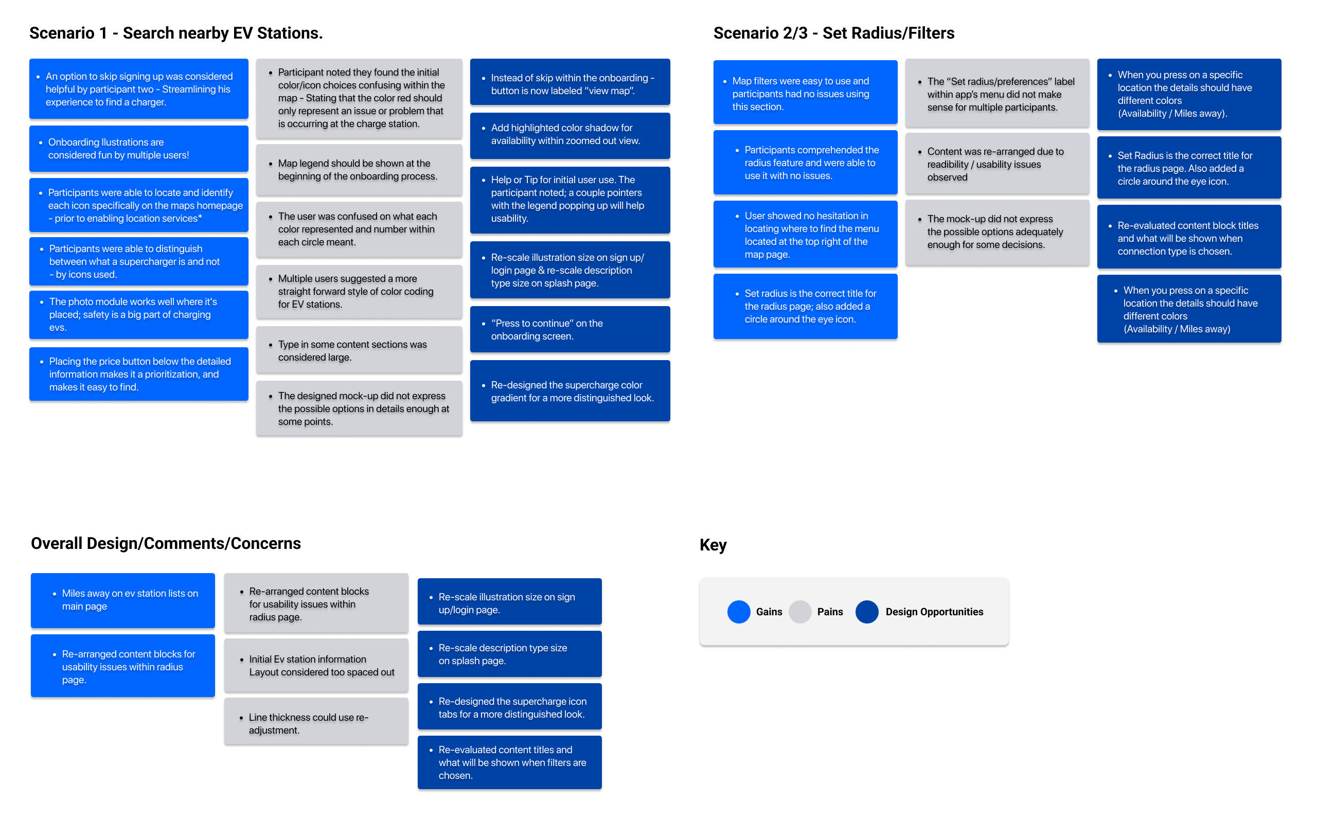
Affinity Map
Overall feedback was positive, with an 100% success rate on all user tasks. Users were tested on the main user task and the two prioritized dashboard features.
Usability Testing
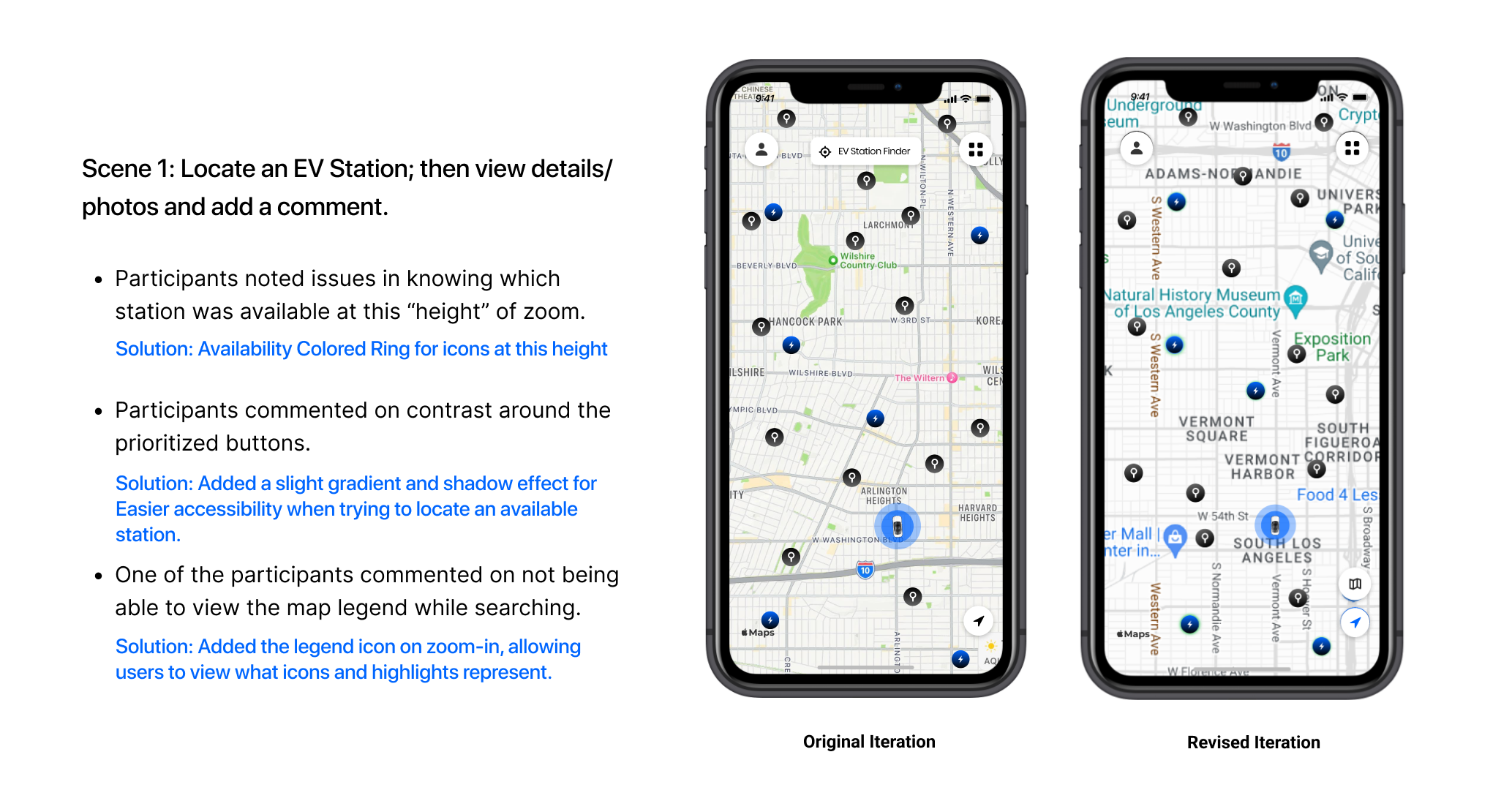
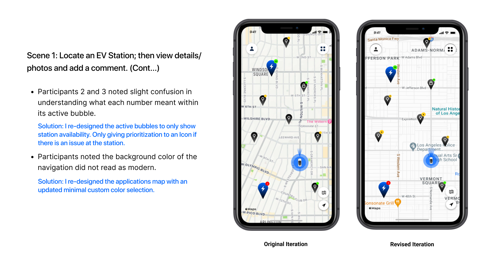
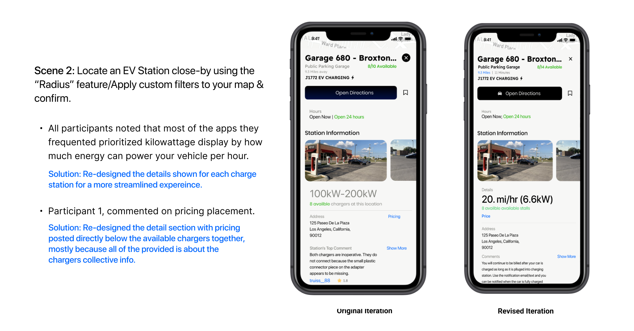
Priority Revisions
After evaluating the pain points and new design opportunities were discussed with my participants, a second iteration of the prototype was developed that includes the following changes:
High Fidelity Design - Revised Design
Final Thoughts
Corenav's final prototype was a great success because I let the MVP's essential matters inform what aspects of the app should be prioritized. The result was gratifying as users found the Corenav easy to use and comprehendible. Public charging is on the forefront. The EV Readiness Index and Biden's infrastructure bill show how the nation is moving towards this new way of transportation. An excellent opportunity for everyday EV owners to utilize a private locating solution with various stations that would technically be outside their network.
Since I developed this project within a 4-week sprint, here are a few things I would consider creating if time and resources were allowed:
- Interviewing and accumulating insights from a larger audience of EV owners.
- Help/FAQ page with tips for initial app use, allowing users a walkthrough before interaction.
- Design additional app pages to test the different dashboard elements and profile page flows.
Thank you


